A strong product idea that needed clearer communication.
Quadzio helps high school students speak with real college ambassadors before choosing where to study. The product had a strong idea: instead of relying only on Reddit threads, college websites or generic advice, students could talk to someone who was actually studying at the college they were considering.
The challenge was clarity. The landing page needed to explain the value faster, show the product experience more clearly, and build enough trust for both students and parents to take action. The product was useful. The page just wasn’t showing what using it actually felt like.
Problem
The product was useful but the page wasn’t showing the experience clearly enough.
First-time visitors needed to understand what Quadzio does, why it matters and why it’s better than free alternatives before they were ready to act.
The headline was clear, but not specific to the emotional moment students face.
The page described features more than it demonstrated the real experience.
Parents were treated as a smaller audience even though they influence the decision.
It didn't clearly explain why Quadzio beats Reddit, Discord or generic advice.
Social proof wasn't repeated near key decision points
The final CTA gave every visitor the same action regardless of intent level.
Make Quadzio easier to understand, trust and act on.
The redesign focused on four priorities: explain the product clearly above the fold, show how the ambassador experience works, build trust with students and parents, and guide visitors toward action with a smoother conversion flow.
The page needed to answer five questions fast
01
What is Quadzio?
02
How does it work?
03
Why should I trust it?
04
Why is this better than free alternatives?
05
What should I do next?
Problem
Conversion strategy, page structure and Figma design direction.
My focus was to make the product easier to understand and easier to trust not just make the page look cleaner.
Landing page audit
Conversion strategy
Page structure
Messaging direction
Hero section improvement
Parent section strategy
Product demonstration ideas
Trust & CTA placement
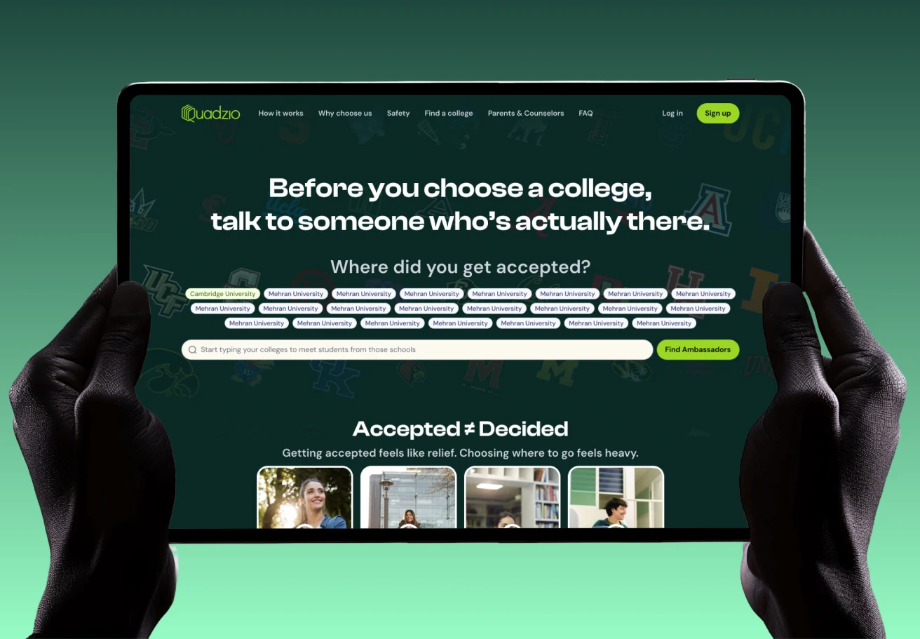
Good foundation, conversational headline, real ambassador profiles, and an “Accepted ≠ Decided” section that captured genuine emotional tension it just needed stronger execution in the moments that drive conversion.
The Strategy
Clarity, trust and product demonstration.
1
Make the product obvious faster
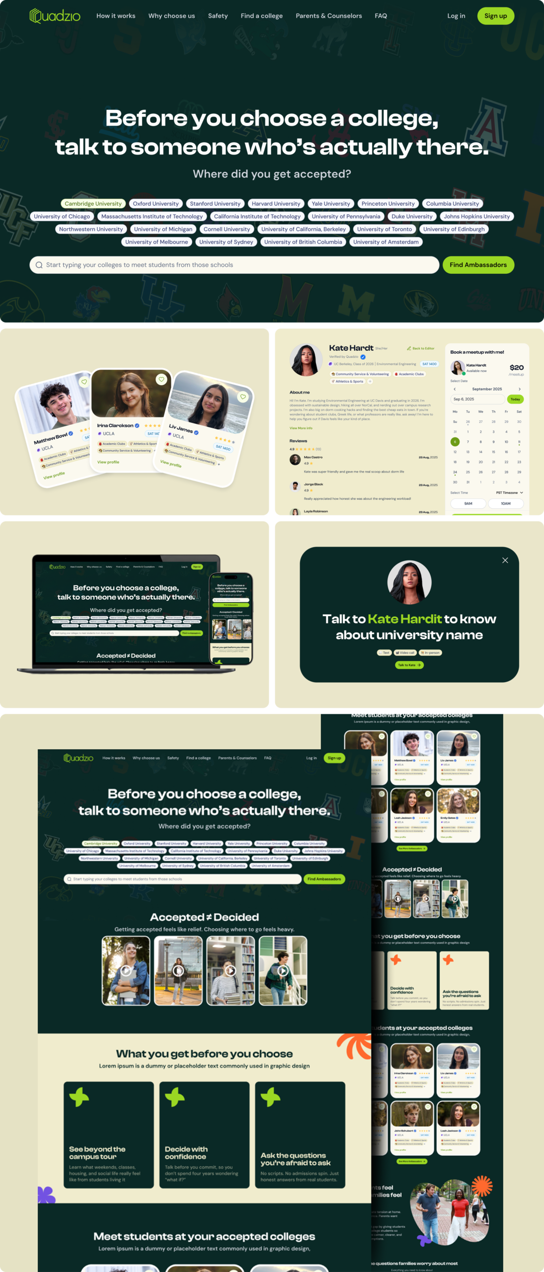
The hero needed to show what happens after a student searches for a college real product moments like ambassador profiles, chat previews, the booking flow or a video call experience, not just a search bar.
2
Build trust before asking for action
Quadzio is a trust sensitive product. Students need to trust the ambassador and parents need to trust the platform. The page needed proof placed before every key CTA.
3
Sell against the real alternatives
Visitors were also comparing Quadzio with Reddit, Discord, family advice and college websites. The page needed to show why structured ambassador conversations beat anonymous or generic advice.
The Solution
A landing page structure built around the decision journey.
Every section earns its place each one does a specific job in moving a confused visitor toward a confident next step.
HERO
01
Core promise + product
Show the core promise and product experience instantly.
PRODUCT IN ACTION
02
See it work
Show how students browse, connect and speak with ambassadors.
ACCEPTED ≠ DECIDED
03
Emotional moment
Use the real tension of college decision stress.
HOW IT WORKS
04
Simple steps
Break the process into clear, simple steps.
FOR PARENTS
05
Reassurance
Address safety, cost, trust and decision confidence.
WHY NOT REDDIT
06
Beat alternatives
Compare anonymous advice with real ambassador guidance.
SOCIAL PROOF
07
Credibility
Add student stories, video proof and ambassador credibility.
FAQ
08
Handle doubt
Resolve objections before the final CTA.
FINAL CTA
09
Next best action
Give visitors the right action based on their intent.
Final Design
Let the visuals do the selling.
Saif should change his title from UI/UX to Problem Solver. He took time to understand our business, asked questions and went to work. He turned a complicated value proposition into something easy to understand. Thrilled with our landing page so much that we’ve already hired him for another project.
Mark
Co-Founder
Turn your website into the sales asset your brand deserves.
If your website looks good but doesn’t convert clearly, I’ll help you find the gaps and show you what needs to change. You’ll walk away with clear insight into what is confusing visitors, what proof is missing and how your page can guide more people toward action.